During it's six years of existence, Durso Cafe evolved from a gourmet italian delicatessen to a prominent breakfast & lunch destination in SoMa.
Existing design no longer fit all local, fresh nourishment. It has proven inefficient and costly in communicating seasonal and evolving offer.
Stage 1: Interior Menu — Proof of Concept
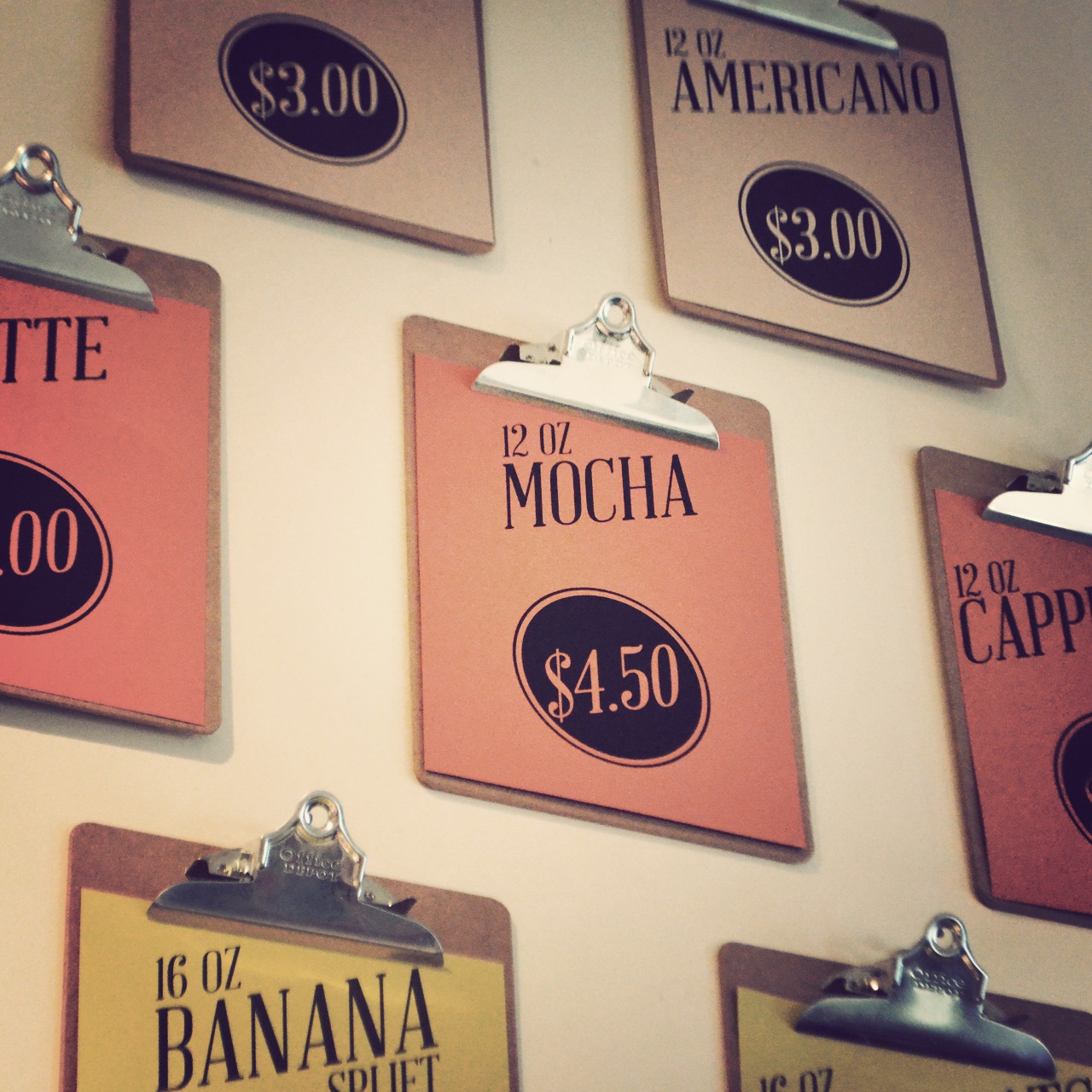
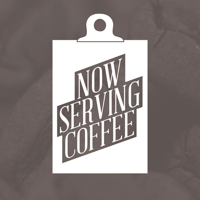
Wall mounted clipboards with custom prints were chosen as a concept candidate for validation. It allowed quick introduction of new products and exposure to customers.
Stage 2: Expanding Menu
Initial concept was well received.
Collected feedback inspired numerous refinments and a decision to expand the concept for the whole dining menu.
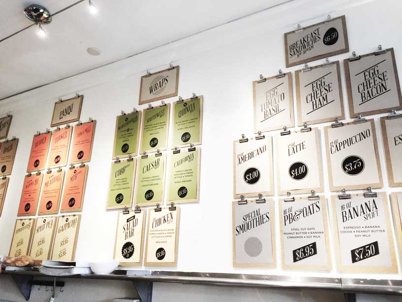
Custom–cut boards allowed for desired dimensions and increased legibility.
Meals were grouped in categories and color–coded, while generous negative space further enhanced quick overview of the cafe's assortment.
Subtle iconography identified vegetarian, as well as the most popular items and add–ons.
Stage 3: Digital Communication
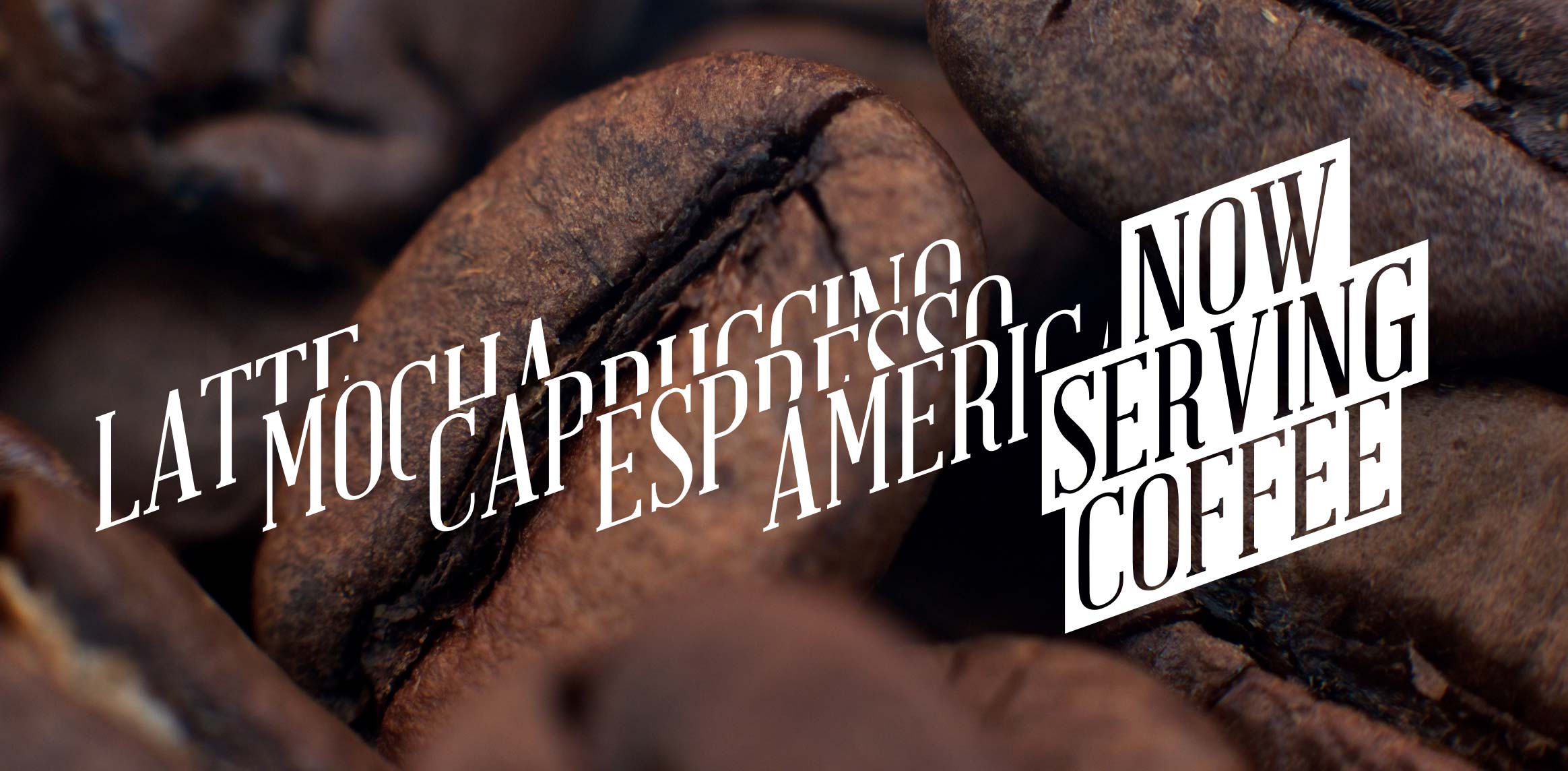
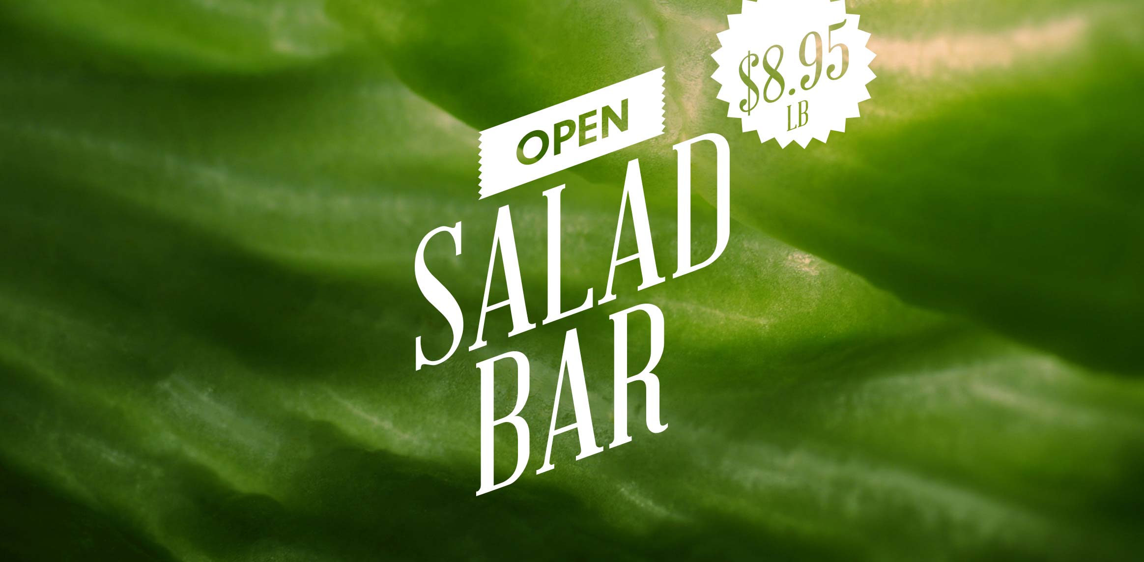
Bold, distinguish typography, simple shapes and lines define in–house & digital communication across the web, social media and email.

